Mobile Friendly or Multi Device Design:
Our sites all use responsive, mobile optimized design.
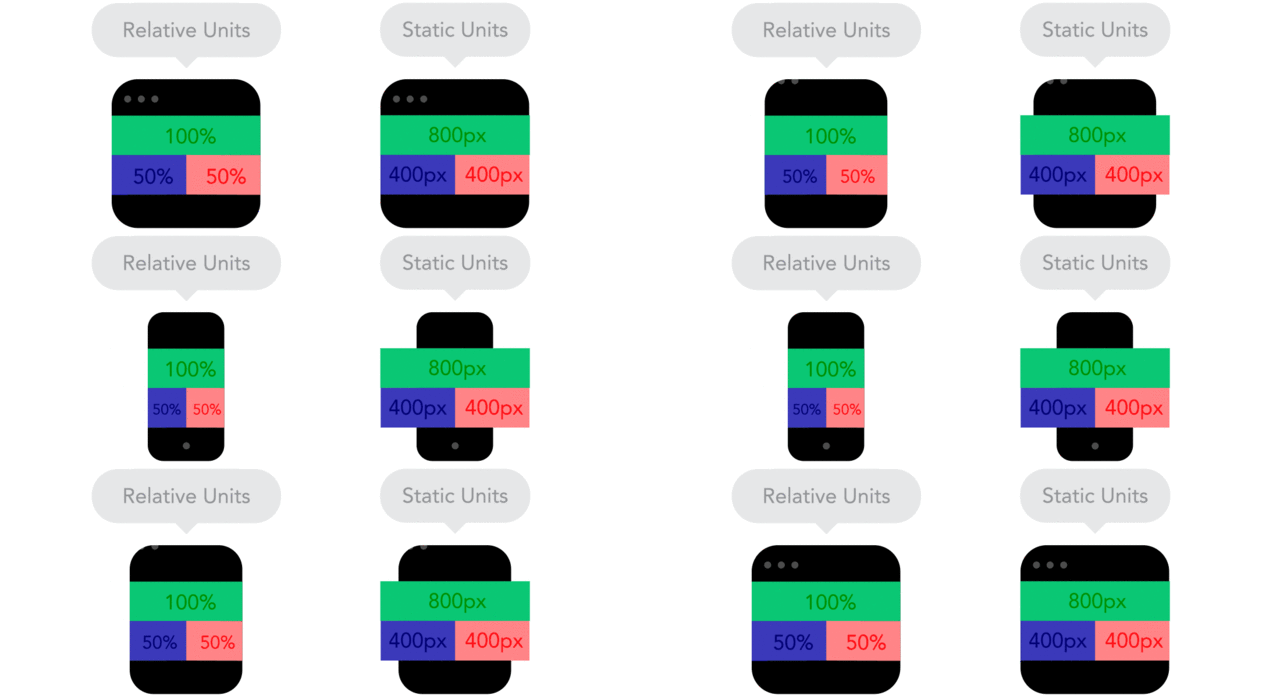
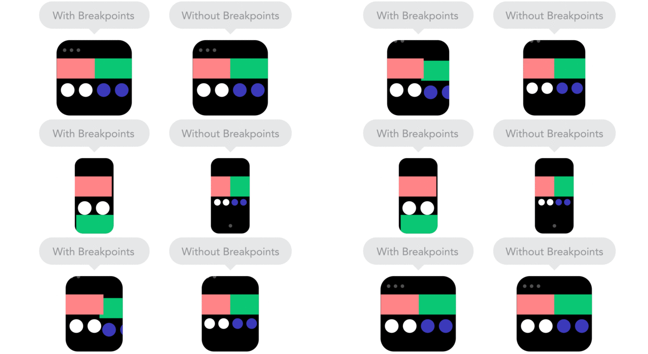
Multi-device design is generally referred to as responsive web design, and it is the industry standard. New commands added to coding languages have made dealing with variable screen sizes easier. Before 2013 most websites used fixed dimensions. Modern design uses a more complex fluid structure to help web pages adapt to the space provided on a screen. If your site is older than 2013, it likely does not look great on devices with small screens.
As time goes on there are more and more mobile devices. At the time of writing, 2020, most websites receive over 70% of their traffic from mobile devices. Mobile is considered primary content and is an important search engine ranking factor. Phone traffic has also helped push a return to minimalist website design. – Simple, clean, and efficient.


Like to get started?
I'M AVAILABLE FOR FREELANCE & CONSULTING WORK
